
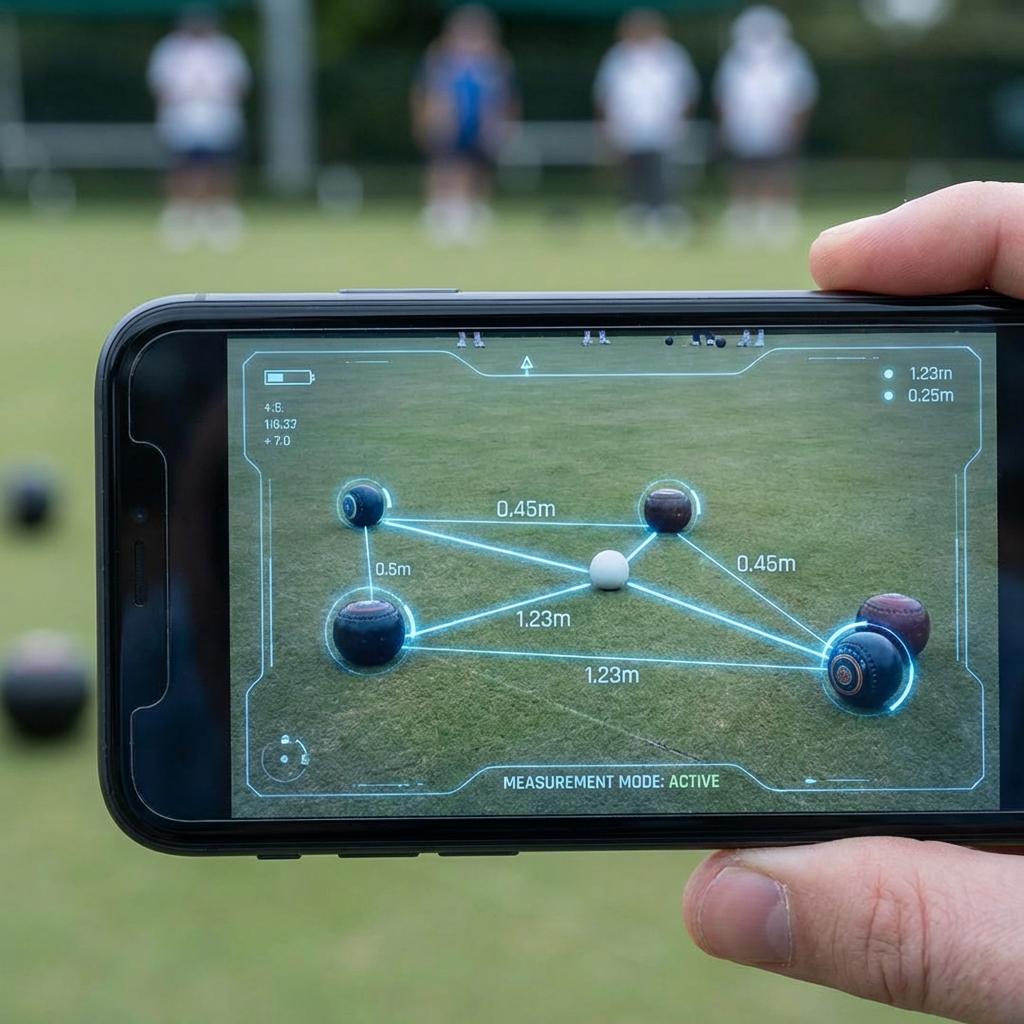
The green is not a desk. A player may be standing in sunlight, holding the phone at an unfamiliar angle, and listening to three people talk about the same close head.
Make the next action obvious.
During a measure, the interface should not ask the player to study a menu. The most important instruction belongs near the camera view, in direct language, with one primary action that can be reached by either hand.
Secondary controls still matter, but they should not compete with the immediate task. When the phone is not level, say so. When the head is ready to capture, say that too. The player should not have to infer the state from motion or colour.
Do not make colour carry the call.
Green, amber, and red can reinforce status, but a colour change alone is easy to miss outdoors and excludes players who do not perceive that difference reliably. Pair every state with plain text, a shape, or a clear change in control label.
The same rule applies to the result. Bowl order, measured distance, and the visual relationship to the jack should be readable without guessing what a coloured outline means.
Design for passing the phone.
At a club, the person who opens WGTS may not be the person who completes the measure. A good flow survives that handover. The current state stays visible, instructions avoid private shorthand, and the result can be shown to the group without navigating away.
That is the practical standard: the interface should be understandable to the person holding the phone now, not only to the person who started the task.
Next field note
Technology should support the conversation.